It was reported that the text was not visible when a solution was selected, so I changed the background and text colors to be more visible. I also changed the background color to green to show greater emphasis.
Nothing earth-shattering here, just a few adjustments and enhancements. I hope everyone had a nice holiday.
- Fixed an issue with the uFurl sizing on mobile. I also made it slightly larger (as seen below)
- Changed the hover color on some elements for uniformity
- Changed the border on some button elements
- Changed the color of the scrollbar so it stands out more
Changelog
Shades of Grey 2.2.3
- Added better contrast when Editor is focused
- Added some minor borders to show missing divisions of some buttons
- Lightened background (slightly) to reduce what I perceived was a harsh blend transition between shades
Changelog
- Compliance update
- Made Avatar background transparent to better blend with user info background
- Fixed Editor highlight color to be more easily seen
Changelog
- Compliance update to correspond to xenForo version
- Added "!important" declaration to enforce scrollbars colors
- This is a xenForo 2.2 compliance upgrade only (nothing new).
- The style has been exported as an "archive" so no need to "extract" the zip file
- Simply import the .zip file as is
Shades of Grey is now a single download with the default accent color of "blue".
If you liked the "cream" colored accent style previously offered (or any other color for that matter), simply go to:
Admin CP > Appearance > Style Properties > Shades of Grey > Color Palette > Color 4 and change it to rgb(226, 226, 188) (see image below)
Also, I've added some additional CSS to enlarge the unfurl image (see examples below), because I felt the image was too small.
You can delete the code in the "extra.less" file if you do not like the change.
Before
After
Change log:
- Added missing borders
- Tweaked tab colors to ensure consistency
- Returned/replaced orange tab with the green tab on "Blue accent" style
- Multiple other minor fixes and enhancements
- Added version numbers to file names for easier recognition
Sorry for all of the updates, but this will be the final. There was yet one more issue I had to fix.
Shades of Blue 2.1.9.6
A few changes yet again...
Shades of Blue 2.1.9.4
- I changed the user info block background color to a lighter shade of grey so it would stand out more and be distinct from the message
- I changed the bottom footer of the login popup menu to a lighter shade to make it look better
Sorry for all the updates, but the style had additional issues that needed to be resolved. This should be the last update for a long while unless somebody discovers a major issue.
Change Log:
- Further adjusted shading
- Darkened (subdued) right side scrollbar
- Other miscellaneous tweaks
A few Changes...
NOTE: I will be working on a few other issues this week, so there will be another release in the coming days
- Added Blue button back
- Slightly darkened all grey shades by 5
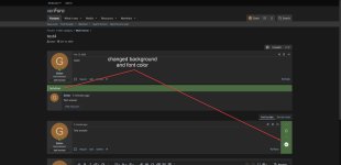
The style has been completely reworked from the ground up, and has a slightly different look. I spent a tremendous amount of time creating the style over the last few days, so I hope you like it. There may be some items I missed, so just let me know if you find any.
I tried my best to blend the shades a little closer to give it a more aesthetic look. If you get a chance, please let me know what you think about it.