- Compatible XF Versions
- 2.0, 2.1
This add-on is for style developers and add-on coders.
Important: this add-on is not ready to be used in production yet. This is early release that might (and probably does) contain bugs. It was developed for XenForo 2.1, though it should work with XenForo 2.0 too.
It adds support for Iconify, offering over 30,000 icons to choose from. Icons can be used for node icons, navigation or anything else add-on or style author can think of (requires creating add-on that depends on this add-on). Authors are no longer limited to using FontAwesome icons.
Basic usage
To add icon to template there is no need to do anything fancy. All you have to do is write Iconify placeholder code like this:
or
See Iconify documentation.
You can change icon dimensions by changing font-size or adding data-width and/or data-height attributes. You can change icon color by changing font color.
Tutorials: how to use custom dimensions, how to transform icons.
Advanced usage
However this add-on's main feature is not basic usage. Basic code can be achieved by simply adding Iconify script tag without this add-on.
What this add-on does is makes it possible to select icons inside XenForo.
Icon style property and option
One of features is icon style property. When creating new style property there is a new property type: icon.
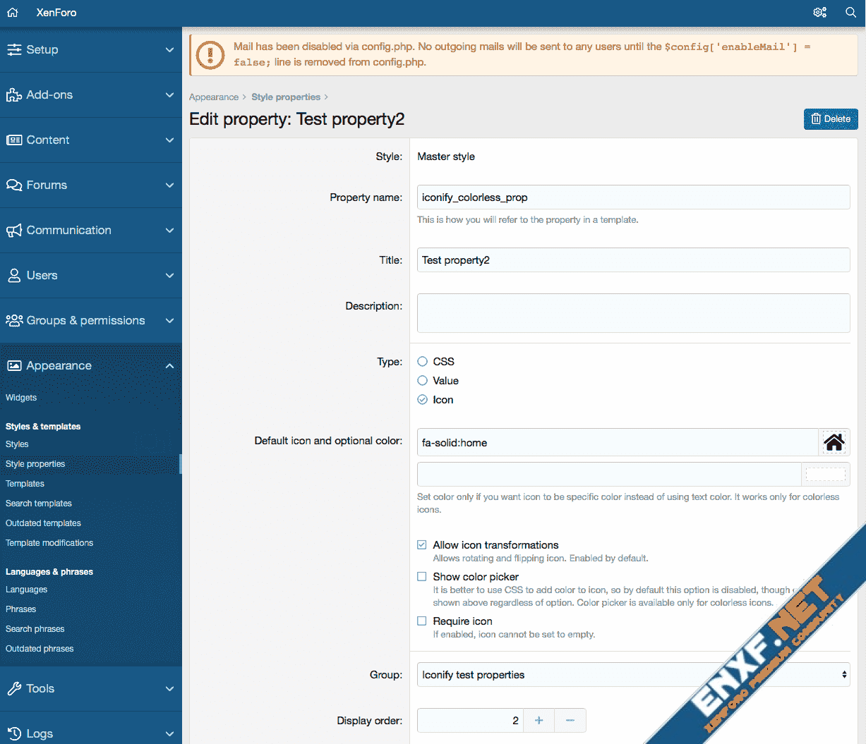
You can pick icon, pick color for colourless icons (or you can disable color picker by unchecking "Show color picker" option). To create icon style property all you have to do is select "Icon" in style property types selection.
Icon style properties look like this in admin panel:
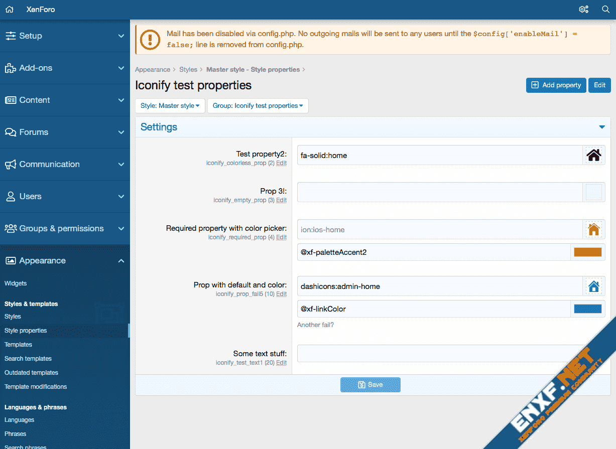
There is a new option type: Icon. It is pretty much identical to style property type.
To create Icon option create new option, select "Icon" from option format list:
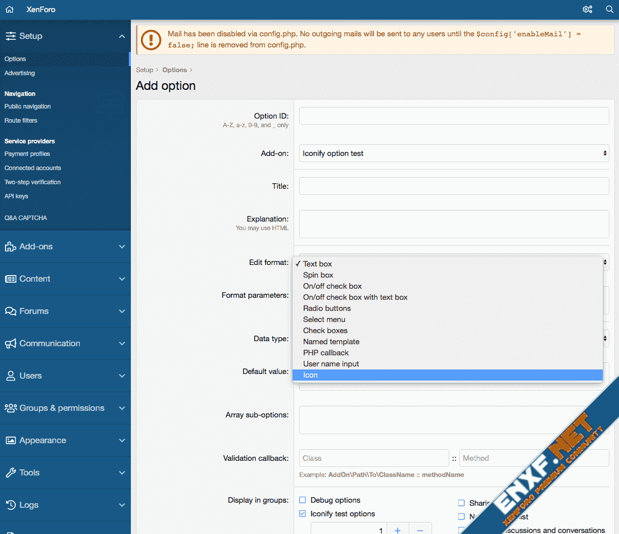
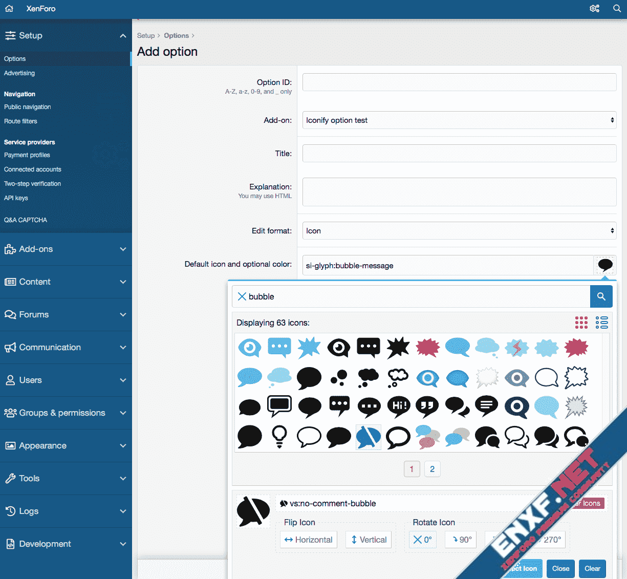
Then pick default icon and set options and create new option.
Icon option in options list looks the same as icon style property in style properties list:
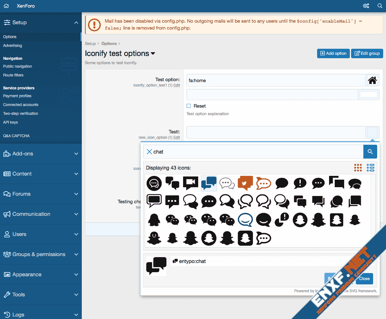
How to use icons in templates
After you have created new style property or option, you'd want to use it in some template. Important: icons are not meant for stylesheet, they should be used only in HTML templates.
To add icon you need to use "icon" or "inlineicon" XenForo template tag:
First 2 lines show how to use option, last 2 lines show how to use style property.
What's the difference between "icon" and "inlineicon"? "icon" tag behaves like image, so it is intended for decorations. "inlineicon" behaves like text, so it is intended to be used inside text, like custom smilies or reactions.
See tutorial that explains difference between inline and block modes.
Creating custom variables
What if you want to create custom variable instead of option or style property? You can do that too.
This add-on adds 2 more tags:
These tags are almost identical to XenForo's "textbox" and "textboxrow".
Value is JSON string.
xf:iconbox
xf:iconbox tag is similar to xf:textbox. Parameters are name, value. But instead of displaying text it displays icon name and icon finder overlay.
Value can be a string, an array or json encoded array. Default format is json encoded array, which is easy to store in database because its a string:
Value array has several keys:
Icon name must start with "icon:", so for example "fa-solid:home" will have value of "icon:fa-solid:home". Additionally there could be transformations, such as "icon-rotate:90deg" or "icon-flip:horizontal".
Example:
Decoded value:
xf:icon
xf:icon accepts same value as xf:iconbox and displays it. If icon is empty, it returns empty string.
This will display icon mdi-arrow-left with red color.
It is also possible to use basic icon name as value:
but this is identical to
so it is pointless. Tag xf:icon is meant to be used with configurable icons, such as style properties and options.
By default icon will have dimensions of 1em x 1em. You can override them by adding "width" and/or "height" attribute. If you specify only one attribute, such as height, width will be automatically set using width/height ratio of icon. See custom dimensions tutorial.
You can also override color by adding "color" attribute. Value can be normal color string or style property name.
You can also add custom class, style and any other attributes. They will be passed to generated iconify-icon or span tag.
xf:inlineicon
xf:inlineicon is identical to xf:icon, except that it will generate span tag instead of iconify-icon tag. That means icon will have negative vertical-alignment that will align it to text just like rendering glyph font. It should be used if you render icon as part of text, such as smiley, not as decoration. See inline vs block tutorial.
Bonus stuff
Also this add-on adds Iconify support to dataList-cell--iconic cells, such as option categories list in XenForo 2.1. All you have to do is use "icon:" as icon name instead of "fa-", such as "icon:emojione-v1:smiling-face-with-sunglasses".
Similar change was added to Add-ons list. Add-ons can also use Iconify icons as their icons, also using "icon:" syntax. This add-on uses it, so you can take a look at addon.json in this add-on as example.
Important: this add-on is not ready to be used in production yet. This is early release that might (and probably does) contain bugs. It was developed for XenForo 2.1, though it should work with XenForo 2.0 too.
It adds support for Iconify, offering over 30,000 icons to choose from. Icons can be used for node icons, navigation or anything else add-on or style author can think of (requires creating add-on that depends on this add-on). Authors are no longer limited to using FontAwesome icons.
Basic usage
To add icon to template there is no need to do anything fancy. All you have to do is write Iconify placeholder code like this:
Code:
<iconify-icon data-icon="mdi:home"></iconify-icon>
Code:
<span class="iconify" data-icon="mdi:home"></span>You can change icon dimensions by changing font-size or adding data-width and/or data-height attributes. You can change icon color by changing font color.
Tutorials: how to use custom dimensions, how to transform icons.
Advanced usage
However this add-on's main feature is not basic usage. Basic code can be achieved by simply adding Iconify script tag without this add-on.
What this add-on does is makes it possible to select icons inside XenForo.
Icon style property and option
One of features is icon style property. When creating new style property there is a new property type: icon.
You can pick icon, pick color for colourless icons (or you can disable color picker by unchecking "Show color picker" option). To create icon style property all you have to do is select "Icon" in style property types selection.
Icon style properties look like this in admin panel:
There is a new option type: Icon. It is pretty much identical to style property type.
To create Icon option create new option, select "Icon" from option format list:
Then pick default icon and set options and create new option.
Icon option in options list looks the same as icon style property in style properties list:
How to use icons in templates
After you have created new style property or option, you'd want to use it in some template. Important: icons are not meant for stylesheet, they should be used only in HTML templates.
To add icon you need to use "icon" or "inlineicon" XenForo template tag:
Code:
<xf:icon value="{$xf.options.text_test_option}" />
<xf:inlineicon value="{$xf.options.text_test_option}" />
<xf:icon value="{{ property('iconify_required_prop') }}" />
<xf:inlineicon value="{{ property('iconify_required_prop') }}" /><br />What's the difference between "icon" and "inlineicon"? "icon" tag behaves like image, so it is intended for decorations. "inlineicon" behaves like text, so it is intended to be used inside text, like custom smilies or reactions.
See tutorial that explains difference between inline and block modes.
Creating custom variables
What if you want to create custom variable instead of option or style property? You can do that too.
This add-on adds 2 more tags:
Code:
xf:iconbox
xf:iconboxrowValue is JSON string.
xf:iconbox
xf:iconbox tag is similar to xf:textbox. Parameters are name, value. But instead of displaying text it displays icon name and icon finder overlay.
Value can be a string, an array or json encoded array. Default format is json encoded array, which is easy to store in database because its a string:
Code:
<xf:iconbox name="my_icon" value="{"value":"icon:emojione:left-arrow"}" />- value: icon value as string. More about it later.
- default: default icon value as string (similar to "value"). Its a default icon that will be displayed if user has not selected custom icon.
- color: color string. If set and not empty, it will be used as icon color instead of using current font color. This optional field is great if you want to make something like custom node icons and allow user to assign color for each node icon.
- showColor: boolean, default is "false". Shows color picker below icon picker that allows user to change value of "color" field.
- canTransform: boolean, default is "true". Allows user to transform icon: rotate, flip. Transformation is stored in "value" field with icon name.
- required: boolean, default is "false". If set, it prevents user from setting value to empty string. This option is ignored if default value is set because default value means icon will always have some value.
Icon name must start with "icon:", so for example "fa-solid:home" will have value of "icon:fa-solid:home". Additionally there could be transformations, such as "icon-rotate:90deg" or "icon-flip:horizontal".
Example:
Code:
<xf:iconbox name="my_icon" value="{"value":"icon:mdi:home icon-flip:horizontal","default":"icon:fa:home","color":"@xf-linkColor","showColor":true}" />
Code:
{
    "value": "icon:mdi:home icon-flip:horizontal",
    "default": "icon:fa:home",
    "color": "@xf-linkColor",
    "showColor": true
}
xf:icon accepts same value as xf:iconbox and displays it. If icon is empty, it returns empty string.
Code:
<xf:icon value="{"value":"icon:mdi-arrow-left","color":"red"}" />It is also possible to use basic icon name as value:
Code:
<xf:icon value="mdi-arrow-left" />
Code:
<iconify-icon data-icon="mdi-arrow-left" />By default icon will have dimensions of 1em x 1em. You can override them by adding "width" and/or "height" attribute. If you specify only one attribute, such as height, width will be automatically set using width/height ratio of icon. See custom dimensions tutorial.
You can also override color by adding "color" attribute. Value can be normal color string or style property name.
Code:
<xf:icon value="{"value":"icon:mdi-arrow-left"}" height="24px" color="@xf-paletteAccent2" />xf:inlineicon
xf:inlineicon is identical to xf:icon, except that it will generate span tag instead of iconify-icon tag. That means icon will have negative vertical-alignment that will align it to text just like rendering glyph font. It should be used if you render icon as part of text, such as smiley, not as decoration. See inline vs block tutorial.
Bonus stuff
Also this add-on adds Iconify support to dataList-cell--iconic cells, such as option categories list in XenForo 2.1. All you have to do is use "icon:" as icon name instead of "fa-", such as "icon:emojione-v1:smiling-face-with-sunglasses".
Similar change was added to Add-ons list. Add-ons can also use Iconify icons as their icons, also using "icon:" syntax. This add-on uses it, so you can take a look at addon.json in this add-on as example.
